Taskify
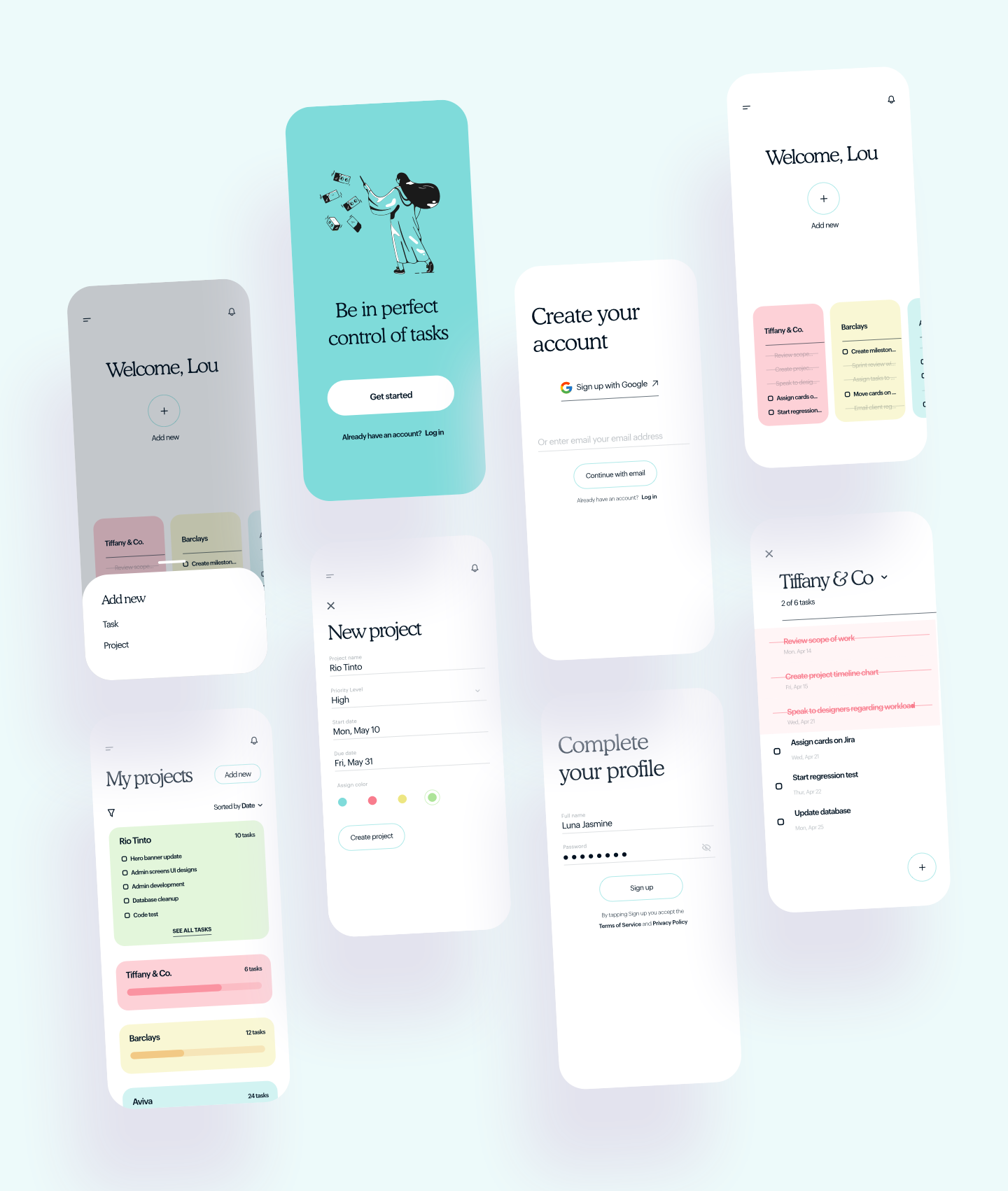
Taskify provides a clean way to create, manage, and complete tasks.
The Challenge
Project managers need a streamlined, clean and easy-to-use method of creating and managing tasks.
My Role
I was the sole designer on this project, undertaking it from inception to completion.
My Design Process
I followed this process to ensure my design decisions were supported by user research and feedback.

Discover
I conducted a heavy discovery phase focusing on user research to identify PMs’ goals, priorities, needs, frustrations, and behaviors related to managing tasks and teams. I analyzed the existing market of digital task management products and noted possible areas of opportunity to better meet user needs, as informed by primary and secondary research.
Define
I delivered a concise UX strategy articulating user beliefs, attitudes, needs, and beliefs for task management. I identified core pain points people currently experience that a new product could address and improve. I articulated a vision for how the new product would improve how and why people set goals and manage tasks.
Ideate
I developed user flows and a clear application map to facilitate multiple user journeys. Focusing on the tracking of exercise, creation of training plans, and sharing data with friends.
Prototype
I designed high-fidelity design composites of key screens and a clickable prototype for testing.
Validate
I conducted usability testing to gather user feedback on the proposed prototype. I identified sources of user error and frustration, user pain points, and areas of delight. I identified and implemented modifications to the prototype to improve the interaction design of the product.
User research
Primary Research: Surveys and Interviews
In order to better understand user needs and behaviors for goal setting and task management, I designed and conducted surveys and interviews, and recruited PMs who had experience setting tasks and managing teams to participate.
The surveys and interviews revealed a few core user needs in task management. Overall, PMs reported the desire for a product that would not only help them stay organized and keep track of tasks and teams, but to be able to clearly see the progress they are making towards accomplishing the tasks as well.

Quotes from research participants about features of ideal task management tools.
Secondary Research: Competitive Analysis
I researched on the swimmers’ wearable apps out there and found out those who seem to be offering the same solution my product will be offering. The aim of this is to pull out useful learnings that could help me build an even better product.
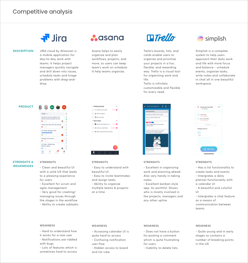
Competitive analysis diagram
Research Analysis and Design Strategy
I then set out to create the key persona for this product. The persona helped to highlight some core user priorities: PMs want a tool that helps them save time, syncs across devices, helps them manage teams seamlessly, and helps them stay organized and feel in control of what they need to accomplish.
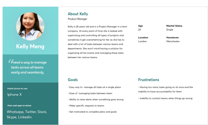
User persona
In order to further hone in on a user’s experience in setting and managing tasks, I developed a customer journey map. The journey map reiterated the pains, gains, and thoughts featured in empathy maps, and provided a visual representation of the emotions that a person might feel while setting out to accomplish a goal.
Through the process of designing a journey map, I distinguished five overarching phases of a person’s journey towards setting a task and managing it: Defining it, Planning it, Delegating the task, Reflecting on the execution, and Completing the task. Developing a journey map was particularly crucial for identifying the pain points someone might feel — and the emotional “roadblocks” or “barriers” that one might face — in the process of accomplishing setting tasks and managing them.
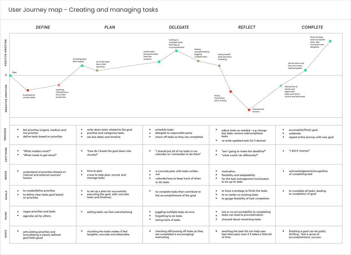
Iterated journey map representing a sample user’s experiences with managing tasks to reach a goal.
Iteraction design
Information Architecture: Application Map
Informed by both the primary and secondary research findings, I drafted an application map to organize content and features. I considered the priorities that research participants indicated as important — such as creating tasks and managing teams, having a calendar, and having reminders — and mapped how they might relate to one another within the information architecture of the product.

A version of the application map
Sketches, Wireframing and Prototyping
The application map informed the key screens that I developed in the first set of low-fidelity sketches. These became the basis of the prototypes I used for the first round of usability testing. Based on the application map I had designed earlier, the prototype included the key screens needed to allow people to sign up for the first time, create a task, and assign the person responsible.
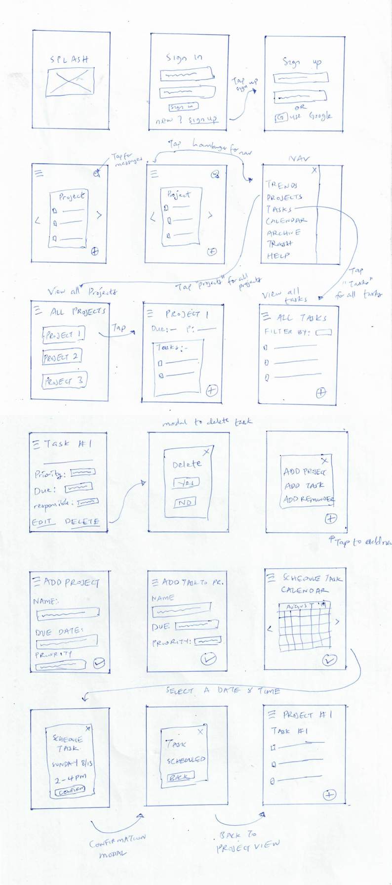
Lofi Sketches of screens
After outlining low-fidelity sketches, I designed mid-fidelity wireframes, which became the basis of the prototypes I used for the first round of usability testing. Based on the user flows I had designed earlier, the prototype included the key screens needed to allow people to sign up for the first time, create a goal, and create a task associated with the goal. I used InVision to make the wireframes dynamic, so that I’d be able to evaluate how people engage with the proposed screens and identify sources of user error and frustration early in the design process.
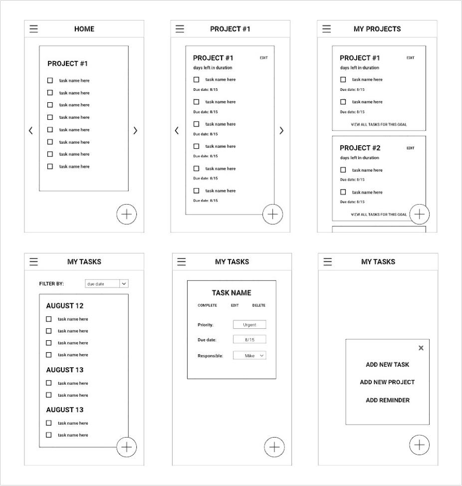
First set of mid-fidelity wireframes
Usability testing
First Round of Testing
I conducted live and remote usability testing with people within the target audiences. As I moved into usability testing, I wanted to know the following:
- Would PMs be able to create an account, create a task, and assign to a teammate?
- Where might people struggle with managing teammates?
- What suggestions might people have for improving the interaction design of the prototype in order to make it easier to navigate and understand, and to make the experience of setting goals and managing tasks more enjoyable?
The usability tests highlighted a number of priority areas of improvement, including the following:
- Users wanted a way to clearly see active and inactive tasks
- Users were confused by the term “Trends” to represent the Analytics screen, and wanted the screen to provide some contextual information about the overall progress on tasks.
- Users wanted to be able to add reminders to a task when creating it, not as a separate activity afterwards.
Iteration and more testing
I iterated on the low-fidelity wireframes based on suggestions that had emerged from the first round of usability testing. I updated form fields within the screens for adding goals and tasks, and added contextual information about progress towards tasks goals to the now Dashboard screen. With a round of iterations in place, I set out to conduct a second round of usability tests.
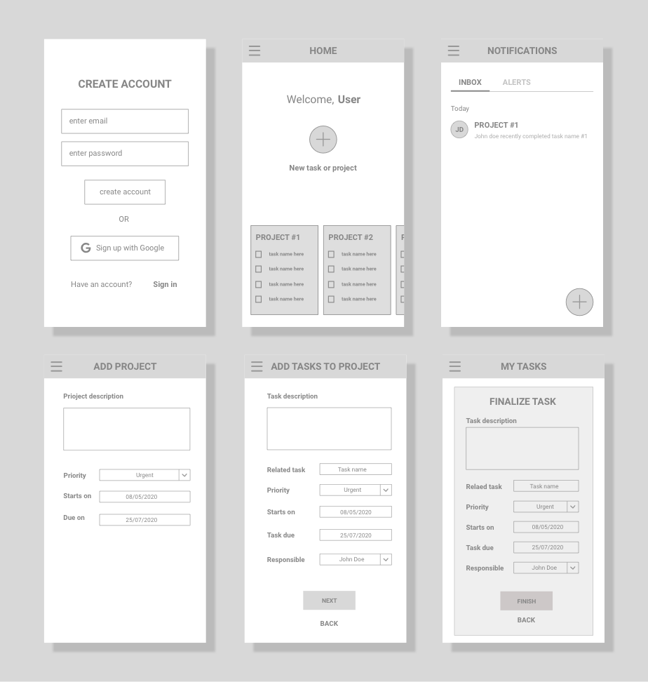
Second set of mid-fidelity wireframes
In the second round of usability testing, participants shared positive feedback about the additional contextual information provided in key screens, and successfully navigated through the core tasks.
At the same time, the tests revealed a few additional key areas of improvement for the prototype that had not emerged in the first round of testing. One area of improvement was to replace some text with icons; people reported that doing so could ease their navigation through screens and improve their navigation speed.
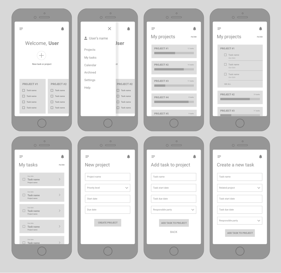
Third set of mid-fidelity wireframes, based on feedback from two rounds of usability testing.
Visual design
Color palette
After reviewing my findings from the initial research phase, I observed that many of the competitor products have predominantly blue color palettes and evoked a sense of simplicity, informality, and friendliness. I experimented with color palettes and typography that would convey some of the same values and characteristics as competitor products, but would also convey reliability, productivity, efficiency, and organization — all of which, according to initial user survey participants, are key for tools that support task management.
In order to narrow down the choices of possible color palettes, I went back to PMs to gather their input and found that they had the strongest preference for the palette that incorporates green, yellow, and red. From there, I further refined the specific hues of the chosen palette in order to better reflect a sense of vibrancy and affirmative energy.

Color palette informed by User research.
UI Design
After several rounds of usability testing and iteration, I designed the high-fidelity screens.
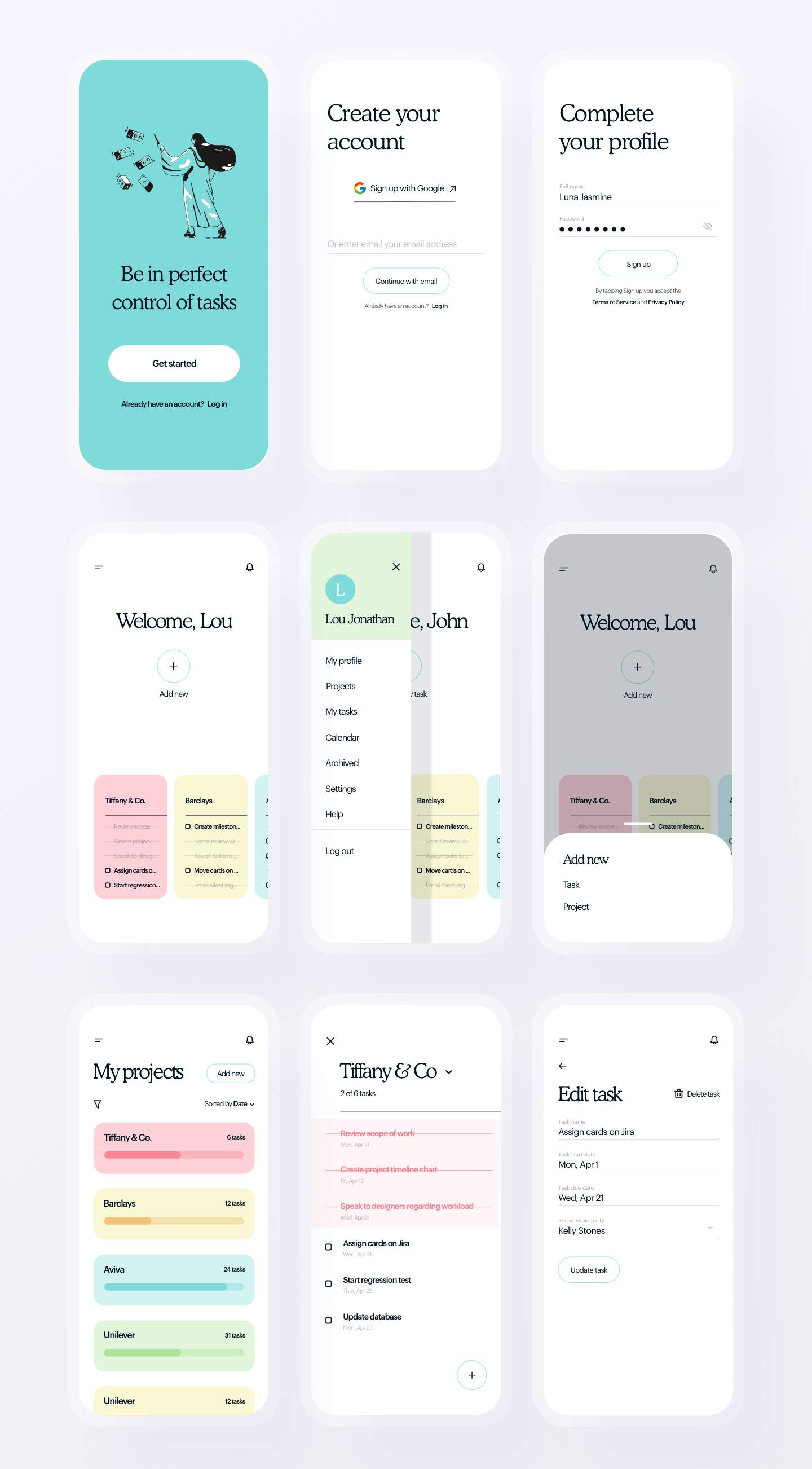
HiFidelity mockups of Auth, Home and Task screens
Key takeaway
It would be important to consider the design of Taskify desktop-based app. Although this project was scoped to mobile app design, the majority of user research participants sought products that can be synced across devices and work fluidly on both desktop and mobile devices. In order for Taskify to meet a core user priority, it would be necessary to design a desktop version in the future as well.
Add me to your team 😊
I am available for full-time, part-time and contract roles.
Open to relocation.
