
Painimation
Painimation help users get diagnosed of their pains and ailments by assessing pain location, quality and intensity using images and animations.
The Challenge
The University of Pittsburgh Medical Center (UPMC), provided my team with a task to imagine a better means for people with pain self diagnose themselves with the use of images and animations.
My Role
Interaction and visual designer: Designed the Information Architecture, Userflows, Wireframes, HiFidelity prototypes and Design system.
User research
Research plan
The research was divided into two parts: Primary Research & Secondary Research. The user interviews part of the primary research was taken care of by the UPMC research team in the US, as they are closer to the users while the secondary research was undertaken has a joint effort by all of the team members.
Stakeholders
Before we proceeded, we first clearly identified all the parties involved in the self-diagnosis process and their interdependencies. The key stakeholders involved are:
- The patients
- Internet resources
- Medicine stores
- Friends / family
- Online community
- Government policies
- Medical records
Their relationship is represented pictorially in a stakeholder map below:
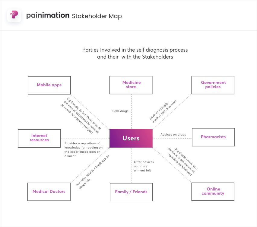
Stakeholder map
User interviews
The research team conducted a nationwide survey of 3,014 adults living in the US. Interviews were over both landlines and cellphones.
From the interviews conducted, we gathered 3 key reasons from the users on why they self diagnose themselves:
- Ease of access through the internet
- Affordability
- Trust
Some of the memorable quotes from the interview are:
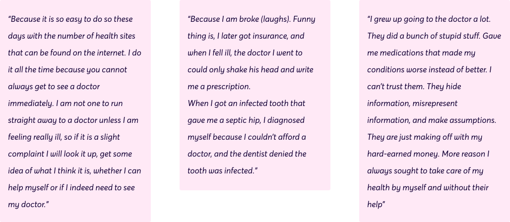
Quotes from research participants about why they self diagnose
Literature review
Simultaneously, we researched literature and articles written in the past about self-diagnosis. From the insights we gathered, we discovered the immense scale of self-diagnosis among adults in the USA. Some critical insights that stood out from the research are:
- More than one-third of adults in the United States go online each year to self diagnose themselves. Castillo (2013)
- 46% said what they found online led them to believe they needed help from a medical professional. Another 38% said they thought they could treat it at home, and 19% say it was in betIen. Eighteen (2015)
- However, less than half -- 41% -- said that a doctor confirmed the diagnosis they made from online research. 35% said they did not seek a professional opinion, and 24% said the medical professional or clinician did not agree with what they thought or had a different idea about their condition. Eighteen (2015)
- 65% of U.S. adults got the information, care, or support from a medical professional, clinician, health-related article/blog/publication. 20% got help from friends and family, while 15% relied on those who had the same health condition. Pew Research Centre (2016)
The critical data gotten from the literature review is represented pictorially below:
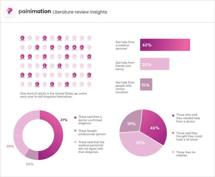
Literature review insights
Competitive Analysis
Lastly, we researched on the self-diagnosis products out there and found out those who seem to be offering the same solution our product will be offering. The aim of this is to pull out useful learnings that could help us build an even better product.
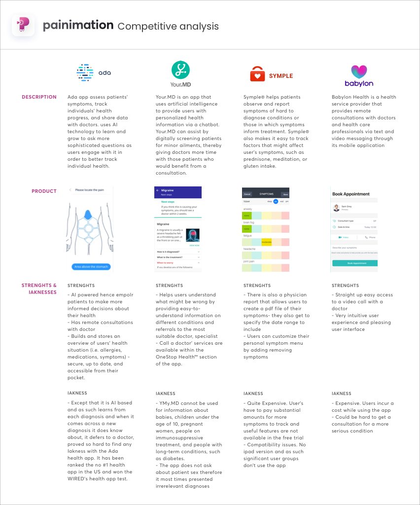
Competitive analysis diagram
Assumptions
Strengthened from these insights above, we began to ideate on solutions to the problem statement. Each individual of the team came up with their own solution to the given problem, out of which assumptions were created. The top three assumptions we made were:
- Adding biometric log in will be a useful feature for users who are in pain as it will make pain entry faster for them.
- Adding a means of messaging between users and doctors will be a useful feature as it will make further consultations easy.
- Placing a daily survey for users to enter their pain level and moods will help in creating a means of assessment or health tracker of how their conditions seem to be fairing.
Synthesis
Personas
Personas helped us to create memorable, realistic characters that represent a set of our stakeholders, and from our research, we identified three prime user segments. Persona was useful for us a reference during the whole design process to remind each of us the person we designing for
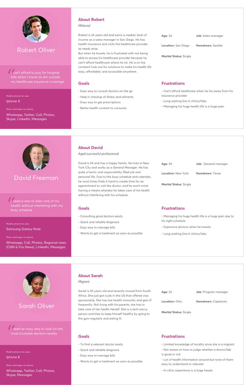
User personas
Experience maps
Experience maps helped us capture the things people say, think, do, and feel at critical touchpoints through the experience. Compared to the personas, experience maps continued over some time.
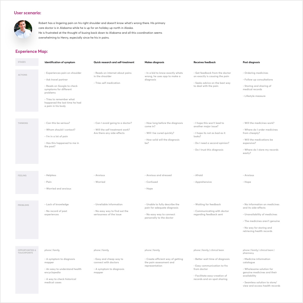
User Journey defined for Persona #1
Interaction design
Userflows
I used the experience map to help me create a visual representation of the userflows. I then used it to make informed decisions when creating the Journey of the user.
The user’s Journey has three key paths:
- Dashboard
- Pain entry
- Messaging
This Journey is represented graphically below:
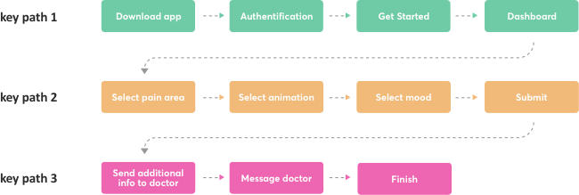
The Journey of the user while using Painimation. Keypaths are explained below.
Keypath 1: Dashboard
The first flow a user gets into is the dashboard. The dashboard contains information and analytics about previous pain entries, areas pain felt most. and previous pain types.
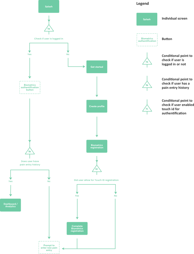
User flow for key path #1
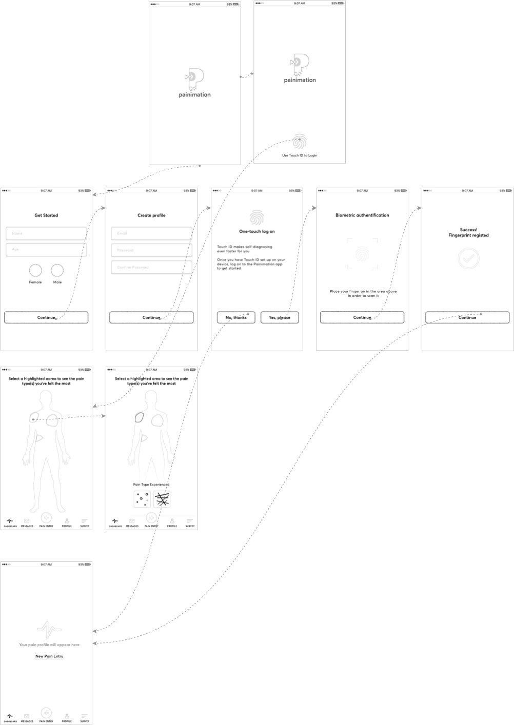
Wireframes showcasing user flow for keypath #1
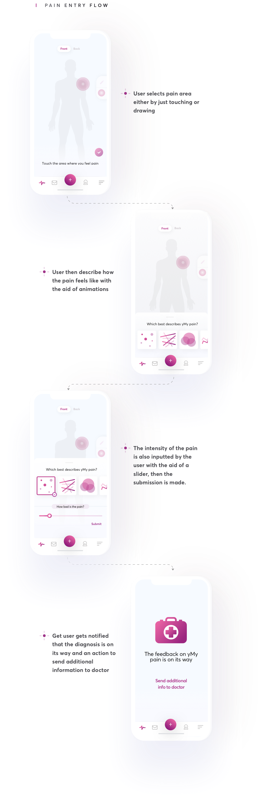
Keypath 2: Pain entry
The pain entry is one of the most important flows of the app as it is the main functionality of the product. The flow contains a lot of intricacies and as such as the architecture, as to be neatly articulated. and previous pain types.
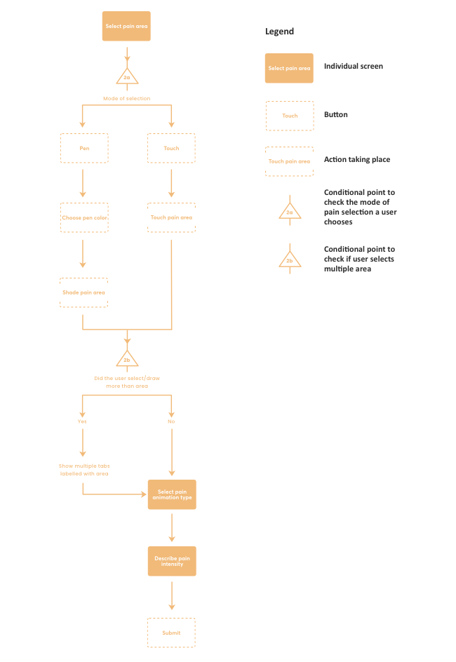
User flow for key path #2
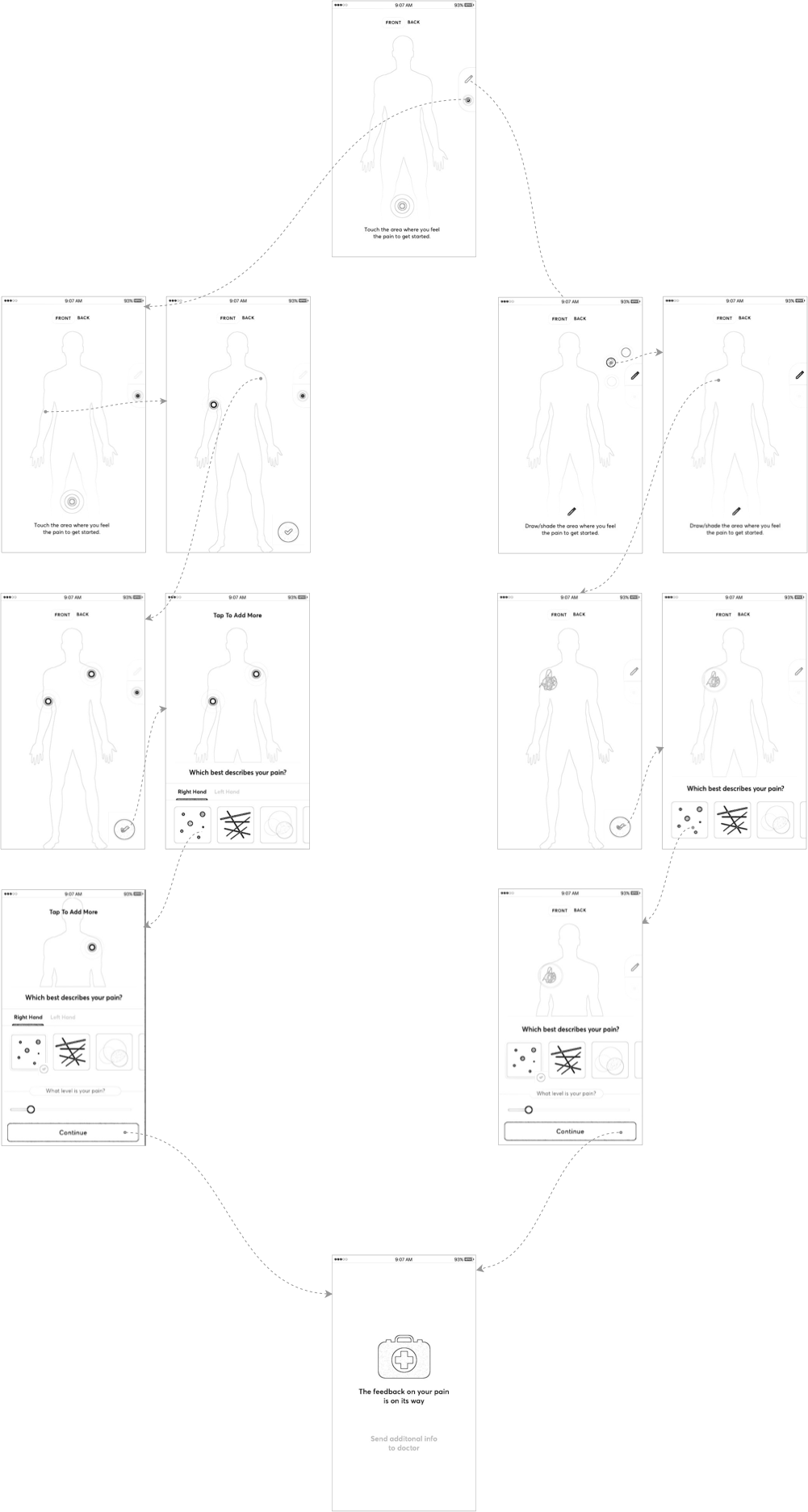
Wireframes showcasing user flow for keypath #2
Keypath 3: Additional information / Messaging
After the pain entry path comes the path for the user to send additional information to the medical personnel giving the diagnosis.
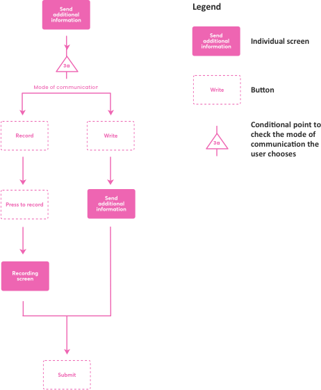
User flow for key path #3
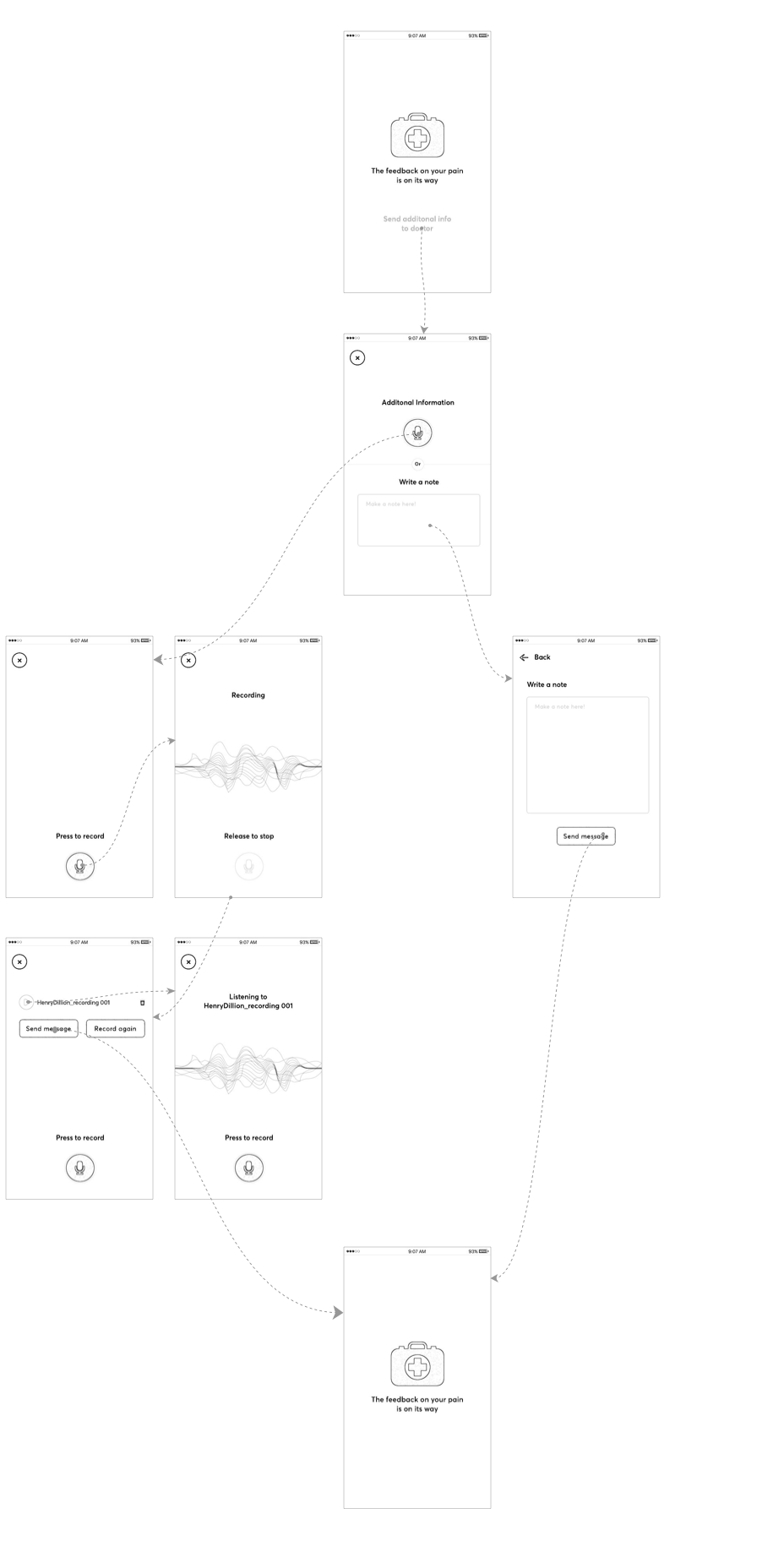
Wireframes showcasing user flow for keypath #3
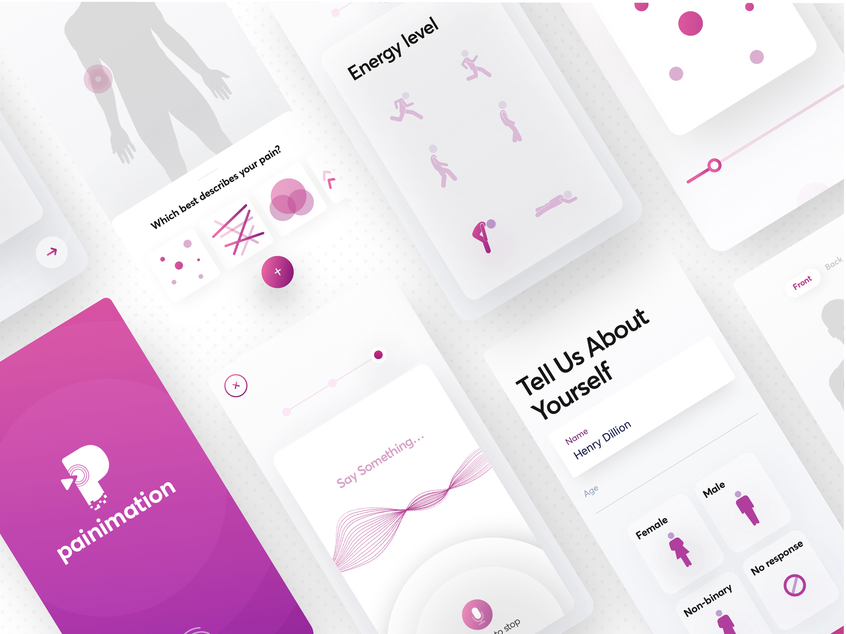
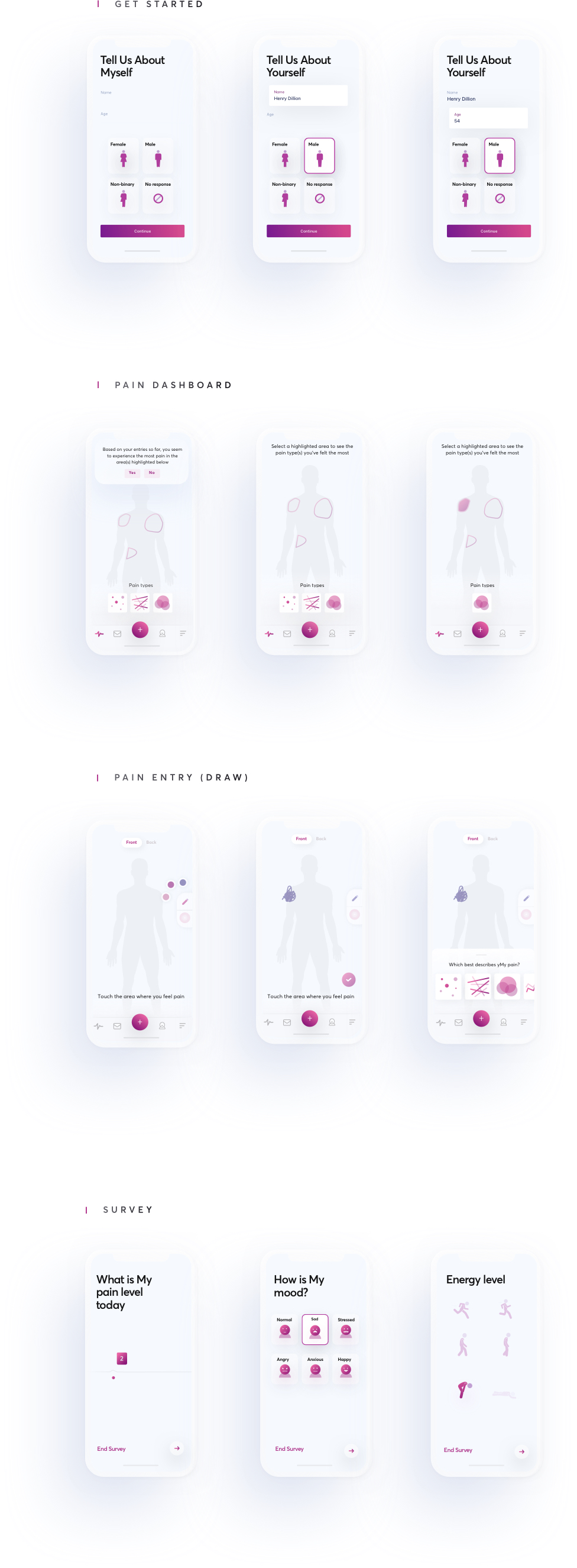
HiFidelity prototypes
The HiFi mockup stage is one of the most exciting parts of every product design project, and this wasn’t different. With inspirations from my mood boards and the guidance of the painimation design system, I proceeded into creating a visually pleasing interface paying close attention to the wireframes I earlier created.
Usability testing / Outcome
After the prototype was complete, usability testing was carried out by printing the Hi-res images of the prototypes on cardboards and distributed to potential users by the UPMC team in the USA.
The idea and user flow were exceptionally received by the users. Most praised its concept and UI while others clamoured that other ailments should be taken into account and not just pain.
Takeaway
This 12-week long project helped me understand that good products are built with human-centered thinking and is amplified when created in collaboration with people of diverse backgrounds.
I significantly saw that design systems, design principles, unified tech databases, and many more centralised systems helped in steering the ship in one unified direction.
Add me to your team 😊
I am available for full-time, part-time and contract roles.
Open to relocation.